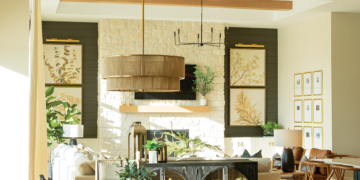
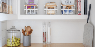
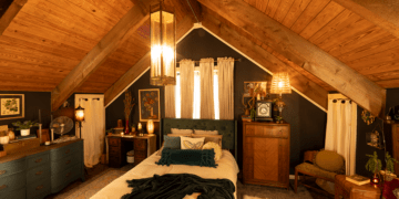
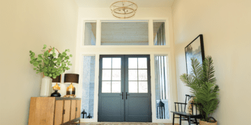
The worldview of ancient peoples often included a set of classical elements in describing the very essence of matter. Earth, Air, Fire, and Water came to symbolize the irreducible powers of the planet.
What could three creative talents do in terms of translating these primordial concepts into the most organic of color palettes?
Let’s see what happens when an award-winning theatrical set designer, a tattoo artist, Omaha Magazine’s creative director, and the color pros from Diamond Vogel use that company’s online Envision Color Visualizer tool to “paint” their inspiration.
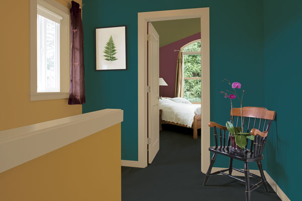
“Brown, beige, clay. These are the colors of earth. We have gone beneath the surface to explore what lies below by choosing minerals and gemstones as our inspiration. The soft gold in the stairwell will refract light in contrast to the rich, blue-green of the walls. Entering the bedroom you find the unexpected element of a green ceiling. Remember that ceilings are your “fifth wall.” They offer a very effective, additional field of color. The complementary color on the bedroom wall is Diamond Vogel’s interpretation of Pantone’s 2014 Color of the Year—Radiant Orchid. All of these colors come together and are grounded by the richly hued earth tones of both the carpet and the light beige trim.”r
Towanda Marks, Pam McCarthy,and Judy NowakrThe Diamond Vogel Team
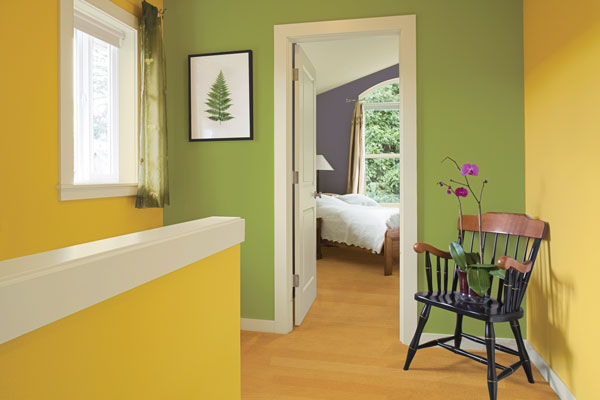
r“Air? You’ve got to be kidding! What the heck am I supposed to do with that which you can’t see? As it turns out, the answer was right under my nose all along. Glancing down at my drafting table I saw the color palette I had chosen for designing our production of Boeing-Boeing. This farcical comedy set in 1962 features a swinging bachelor who juggles a gaggle of what were then called “stewardesses.” I had selected a somewhat subdued and breezy, ‘60s-themed collection of hues (think Marimekko design mixed with a bit of early Warhol) to evoke an airy, almost weightless feel for the era when jet air travel was still new, exotic, and…well, downright sexy.” r
Jim OthuserScenic and Lighting Designer, Omaha Community Playhouse
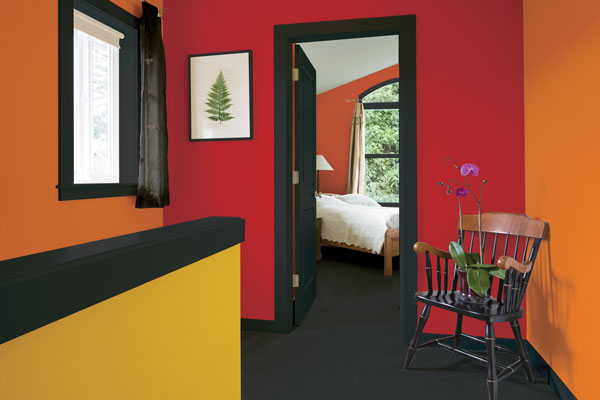
r“When contemplating my assigned element, my mind immediately went to thoughts of enjoying the ambiance of a cozy fire surrounded by low-light candles enveloping me in a serene, flickering glow. It instantly evokes an aura of home, warmth, and safety. As a tattoo artist, I approached the room as I would a tattoo. I chose a combination of colors that compliment each other to create a beautiful and unique canvas. With the element of fire, I thought of reds, oranges, and yellows. I used them here to create a room that feels pleasant, mellow, and comforting…much like a relaxing evening in front of the fireplace.”r
Johnna McCrearyrTattoo artist and co-owner, Liquid Courage Tattoos
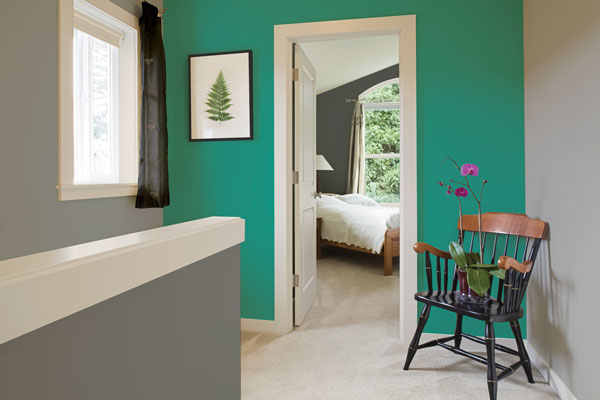
r“My aquatic inspiration came from Pantone’s 2013 color of the year—Emerald. More importantly—and a lot dearer to my heart—is the fact that this is the assortment of colors that my wife, Trisha, and I are using to prepare a nursery as we await the birth of our first child. Clean lines and cleaner palettes are found throughout our home, so I’ve reflected that theme with gray-ish surfaces that exist only to ground and add “oomph” to the brighter, more vibrant hues surrounding them. We’ll be adding coral-tinted accents in throw pillows and other soft elements to punctuate the room with some “pop.” Come late September, the nursery will be the center of activity on so many much-anticipated (but probably sleepless) nights.”r
John GawleyrCreative Director, Omaha Magazine


